Components
Avatar
Avatar
Animated avatar component with status indicators, multiple shapes, and customizable sizes.
Basic Avatars
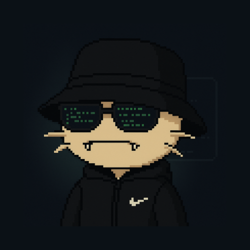
Image Avatars
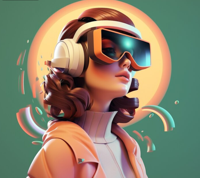
3D Interactive Avatars
Status Indicators
Shape Variants
Animated Demo
🎮 Interactive Features
- Hover: 3D rotation and glow effects
- Click: Scale animation feedback
- Glow: Dynamic lighting effects
- Particles: Floating animation particles on hover
- Status: Real-time status indicators
Installation
1
Install the packages
npm i motion clsx tailwind-merge2
Add util file
lib/util.ts
import { ClassValue, clsx } from "clsx";
import { twMerge } from "tailwind-merge";

export function cn(...inputs: ClassValue[]) {
  return twMerge(clsx(inputs));
}
import { ClassValue, clsx } from "clsx";
import { twMerge } from "tailwind-merge";

export function cn(...inputs: ClassValue[]) {
  return twMerge(clsx(inputs));
}
3
Copy and paste the following code into your project
avatar.tsx
"use client";

import { cn } from "@/lib/utils";
import { motion } from "motion/react";
import React, { useState } from "react";

interface AvatarProps {
  src?: string;
  alt?: string;
  fallback?: string;
  size?: "sm" | "md" | "lg" | "xl";
  shape?: "circle" | "square" | "rounded";
  animated?: boolean;
  status?: "online" | "offline" | "away" | "busy";
  glow?: boolean;
  interactive?: boolean;
  variant?: "default" | "glass" | "neon";
}

const Avatar: React.FC<AvatarProps> = ({
  src,
  alt = "Avatar",
  fallback = "U",
  size = "md",
  shape = "circle",
  animated = false,
  status,
  glow = false,
  interactive = false,
  variant = "default"
}) => {
  const [isHovered, setIsHovered] = useState(false);

  const sizeClasses = {
    sm: "h-8 w-8 text-sm",
    md: "h-12 w-12 text-base",
    lg: "h-16 w-16 text-lg",
    xl: "h-24 w-24 text-xl",
  };

  const shapeClasses = {
    circle: "rounded-full",
    square: "rounded-none",
    rounded: "rounded-lg",
  };

  const statusColors = {
    online: "bg-green-500",
    offline: "bg-gray-500",
    away: "bg-yellow-500",
    busy: "bg-red-500",
  };

  const variantClasses = {
    default: "bg-neutral-700",
    glass: "bg-white/10 backdrop-blur-md border border-white/20",
    neon: "bg-gradient-to-br from-purple-500 to-pink-500"
  };

  const avatarContent = (
    <motion.div
      className="relative inline-block"
      onHoverStart={() => setIsHovered(true)}
      onHoverEnd={() => setIsHovered(false)}
      style={{ perspective: "1000px", transformStyle: "preserve-3d" }}
    >
      {/* Glow effect */}
      {glow && (
        <motion.div
          className="absolute inset-0 rounded-full bg-gradient-to-r from-blue-500 to-purple-500 blur-xl opacity-0"
          animate={isHovered ? { opacity: 0.6, scale: 1.2 } : { opacity: 0, scale: 1 }}
          transition={{ duration: 0.3 }}
        />
      )}

      <motion.div
        className={cn(
          "relative flex items-center justify-center overflow-hidden text-white font-medium",
          sizeClasses[size],
          shapeClasses[shape],
          variantClasses[variant]
        )}
        animate={{
          rotateY: isHovered && interactive ? 15 : 0,
          rotateX: isHovered && interactive ? 10 : 0,
          scale: isHovered ? 1.05 : 1,
          boxShadow: isHovered && glow
            ? "0 20px 40px rgba(0,0,0,0.3), 0 0 20px rgba(59, 130, 246, 0.5)"
            : "0 4px 6px rgba(0,0,0,0.1)"
        }}
        transition={{ type: "spring", stiffness: 300, damping: 20 }}
        style={{ transformStyle: "preserve-3d" }}
      >
        {/* 3D inner shadow */}
        <motion.div
          className="absolute inset-0 bg-gradient-to-br from-white/20 to-transparent"
          animate={{ opacity: isHovered ? 0.3 : 0.1 }}
          transition={{ duration: 0.2 }}
        />

        {src ? (
          <motion.div
            className="relative w-full h-full overflow-hidden"
            animate={{
              scale: isHovered ? 1.1 : 1
            }}
            transition={{ duration: 0.2 }}
          >
            <img
              src={src}
              alt={alt}
              className="w-full h-full object-cover"
            />
          </motion.div>
        ) : (
          <motion.span
            animate={{
              scale: isHovered ? 1.1 : 1,
              textShadow: isHovered && glow ? "0 0 10px rgba(255,255,255,0.5)" : "none"
            }}
            transition={{ duration: 0.2 }}
          >
            {fallback}
          </motion.span>
        )}

        {/* Animated border */}
        {interactive && (
          <motion.div
            className="absolute inset-0 rounded-full border-2 border-transparent"
            animate={isHovered ? {
              borderColor: "rgba(59, 130, 246, 0.5)",
              boxShadow: "0 0 20px rgba(59, 130, 246, 0.3)"
            } : {}}
            transition={{ duration: 0.3 }}
          />
        )}
      </motion.div>

      {/* Status indicator with 3D effect */}
      {status && (
        <motion.div
          className={cn(
            "absolute -bottom-1 -right-1 h-3 w-3 rounded-full border-2 border-neutral-900",
            statusColors[status]
          )}
          animate={{
            scale: isHovered ? 1.2 : 1,
            boxShadow: isHovered ? "0 0 8px currentColor" : "none"
          }}
          transition={{ duration: 0.2 }}
        />
      )}

      {/* Floating particles effect */}
      {interactive && isHovered && (
        <motion.div className="absolute inset-0 pointer-events-none">
          {[...Array(6)].map((_, i) => (
            <motion.div
              key={i}
              className="absolute w-1 h-1 bg-blue-400 rounded-full"
              initial={{ x: "50%", y: "50%", opacity: 0 }}
              animate={{
                x: `${50 + Math.cos(i * 60 * Math.PI / 180) * 30}%`,
                y: `${50 + Math.sin(i * 60 * Math.PI / 180) * 30}%`,
                opacity: [0, 1, 0]
              }}
              transition={{ duration: 2, repeat: Infinity, delay: i * 0.1 }}
            />
          ))}
        </motion.div>
      )}
    </motion.div>
  );

  if (animated) {
    return (
      <motion.div
        initial={{ opacity: 0, scale: 0.8, rotateY: -20 }}
        animate={{ opacity: 1, scale: 1, rotateY: 0 }}
        whileHover={{ scale: 1.1, rotateY: 5, z: 50 }}
        transition={{ type: "spring", stiffness: 300, damping: 20 }}
        style={{ transformStyle: "preserve-3d" }}
      >
        {avatarContent}
      </motion.div>
    );
  }

  return avatarContent;
};

export default Avatar;
"use client";
import { cn } from "@/lib/utils";
import { motion } from "motion/react";
import React, { useState } from "react";
interface AvatarProps {
src?: string;
alt?: string;
fallback?: string;
size?: "sm" | "md" | "lg" | "xl";
shape?: "circle" | "square" | "rounded";
animated?: boolean;
status?: "online" | "offline" | "away" | "busy";
glow?: boolean;
interactive?: boolean;
variant?: "default" | "glass" | "neon";
}
const Avatar: React.FC<AvatarProps> = ({
src,
alt = "Avatar",
fallback = "U",
size = "md",
shape = "circle",
animated = false,
status,
glow = false,
interactive = false,
variant = "default"
}) => {
const [isHovered, setIsHovered] = useState(false);
const sizeClasses = {
sm: "h-8 w-8 text-sm",
md: "h-12 w-12 text-base",
lg: "h-16 w-16 text-lg",
xl: "h-24 w-24 text-xl",
};
const shapeClasses = {
circle: "rounded-full",
square: "rounded-none",
rounded: "rounded-lg",
};
const statusColors = {
online: "bg-green-500",
offline: "bg-gray-500",
away: "bg-yellow-500",
busy: "bg-red-500",
};
const variantClasses = {
default: "bg-neutral-700",
glass: "bg-white/10 backdrop-blur-md border border-white/20",
neon: "bg-gradient-to-br from-purple-500 to-pink-500"
};
const avatarContent = (
<motion.div
className="relative inline-block"
onHoverStart={() => setIsHovered(true)}
onHoverEnd={() => setIsHovered(false)}
style={{ perspective: "1000px", transformStyle: "preserve-3d" }}
>
{/* Glow effect */}
{glow && (
<motion.div
className="absolute inset-0 rounded-full bg-gradient-to-r from-blue-500 to-purple-500 blur-xl opacity-0"
animate={isHovered ? { opacity: 0.6, scale: 1.2 } : { opacity: 0, scale: 1 }}
transition={{ duration: 0.3 }}
/>
)}
<motion.div
className={cn(
"relative flex items-center justify-center overflow-hidden text-white font-medium",
sizeClasses[size],
shapeClasses[shape],
variantClasses[variant]
)}
animate={{
rotateY: isHovered && interactive ? 15 : 0,
rotateX: isHovered && interactive ? 10 : 0,
scale: isHovered ? 1.05 : 1,
boxShadow: isHovered && glow
? "0 20px 40px rgba(0,0,0,0.3), 0 0 20px rgba(59, 130, 246, 0.5)"
: "0 4px 6px rgba(0,0,0,0.1)"
}}
transition={{ type: "spring", stiffness: 300, damping: 20 }}
style={{ transformStyle: "preserve-3d" }}
>
{/* 3D inner shadow */}
<motion.div
className="absolute inset-0 bg-gradient-to-br from-white/20 to-transparent"
animate={{ opacity: isHovered ? 0.3 : 0.1 }}
transition={{ duration: 0.2 }}
/>
{src ? (
<motion.div
className="relative w-full h-full overflow-hidden"
animate={{
scale: isHovered ? 1.1 : 1
}}
transition={{ duration: 0.2 }}
>
<img
src={src}
alt={alt}
className="w-full h-full object-cover"
/>
</motion.div>
) : (
<motion.span
animate={{
scale: isHovered ? 1.1 : 1,
textShadow: isHovered && glow ? "0 0 10px rgba(255,255,255,0.5)" : "none"
}}
transition={{ duration: 0.2 }}
>
{fallback}
</motion.span>
)}
{/* Animated border */}
{interactive && (
<motion.div
className="absolute inset-0 rounded-full border-2 border-transparent"
animate={isHovered ? {
borderColor: "rgba(59, 130, 246, 0.5)",
boxShadow: "0 0 20px rgba(59, 130, 246, 0.3)"
} : {}}
transition={{ duration: 0.3 }}
/>
)}
</motion.div>
{/* Status indicator with 3D effect */}
{status && (
<motion.div
className={cn(
"absolute -bottom-1 -right-1 h-3 w-3 rounded-full border-2 border-neutral-900",
statusColors[status]
)}
animate={{
scale: isHovered ? 1.2 : 1,
boxShadow: isHovered ? "0 0 8px currentColor" : "none"
}}
transition={{ duration: 0.2 }}
/>
)}
{/* Floating particles effect */}
{interactive && isHovered && (
<motion.div className="absolute inset-0 pointer-events-none">
{[...Array(6)].map((_, i) => (
<motion.div
key={i}
className="absolute w-1 h-1 bg-blue-400 rounded-full"
initial={{ x: "50%", y: "50%", opacity: 0 }}
animate={{
x: `${50 + Math.cos(i * 60 * Math.PI / 180) * 30}%`,
y: `${50 + Math.sin(i * 60 * Math.PI / 180) * 30}%`,
opacity: [0, 1, 0]
}}
transition={{ duration: 2, repeat: Infinity, delay: i * 0.1 }}
/>
))}
</motion.div>
)}
</motion.div>
);
if (animated) {
return (
<motion.div
initial={{ opacity: 0, scale: 0.8, rotateY: -20 }}
animate={{ opacity: 1, scale: 1, rotateY: 0 }}
whileHover={{ scale: 1.1, rotateY: 5, z: 50 }}
transition={{ type: "spring", stiffness: 300, damping: 20 }}
style={{ transformStyle: "preserve-3d" }}
>
{avatarContent}
</motion.div>
);
}
return avatarContent;
};
export default Avatar;4
Update the import paths to match your project setup
Props
| Prop | Type | Default | Description |
|---|---|---|---|
| src | string | undefined | Image source URL for the avatar. |
| alt | string | Avatar | Alt text for the avatar image. |
| fallback | string | U | Fallback text when no image is provided. |
| size | string | md | Avatar size (sm, md, lg, xl). |
| shape | string | circle | Avatar shape (circle, square, rounded). |
| animated | boolean | false | Enable advanced 3D hover animations. |
| status | string | undefined | User status indicator (online, offline, away, busy). |
| glow | boolean | false | Enable dynamic glow effects on hover. |
| interactive | boolean | false | Enable 3D rotation and particle effects. |
| variant | string | default | Visual variant (default, glass, neon). |